Horror camera angles and lighting for animated Shorts: a shot-by-shot guide
Fear on a phone screen comes from where the camera stands and where the light falls. What each choice does, how to plan it shot by shot and how to build it for flat 2D art in code.
By Homingo Learn ·
Horror cinematographers work with a short list of tools: where the camera stands, how it moves, and which part of the frame the light is allowed to reach. An animated vertical Short uses the same tools, with two differences. The frame is tall and small, so every choice has to read at a glance on a phone. And there is no set: a camera move is a transform on your art layers, and a light is a layer you draw. This guide covers both halves, the film grammar and the code for it.
What each camera angle tells the viewer
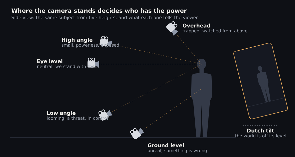
The height of the camera decides who looks strong. That is the whole trick, and horror uses it in both directions:
- Overhead: the subject is pinned to the floor plan, small and watched. Good for "something is above them" and for showing a room the viewer will need to remember.
- High angle: the subject looks small and exposed. Use it on the person in danger, just before things get worse.
- Eye level: neutral. We stand with them. Most of the episode lives here, which is why the other angles land when they arrive.
- Low angle: looming and in control. Save it for the threat, or for the one moment the person in danger fights back.
- Ground level: unreal and wrong, the view of something that should not be watching. Use it once per episode at most.
- Dutch tilt: the horizon is off its level, so the world feels off. A few degrees is enough; a big tilt reads as a style, not as unease.
Decide the angle from one question per beat: who has the power right now? If the answer changes inside a beat, that is where the cut goes.
Framing a vertical 9:16 frame
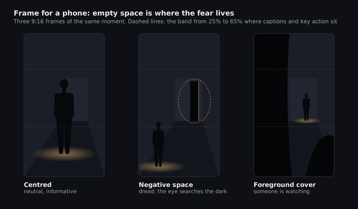
A tall frame gives you less width and a lot of height. Horror can use that height as empty space, and empty space is where the viewer searches for the threat.
- Centred is clear and informative. It is right for the hook, when the viewer must understand the problem in one look.
- Negative space puts the subject low and to one side and leaves a dark doorway, window or corridor in the rest of the frame. The viewer looks where nothing is yet. That is dread.
- Foreground cover frames the subject past a dark shape close to the camera: a door edge, a shelf, the back of a chair. The frame now has a point of view, and the viewer wonders whose.
Keep the face, the key action and the caption inside the central band, roughly 25% to 65% from the top, because the app’s own text and buttons cover the bottom and the right edge. Our Shorts safe zone guide has the exact pixel boxes.
Camera moves and when to use them
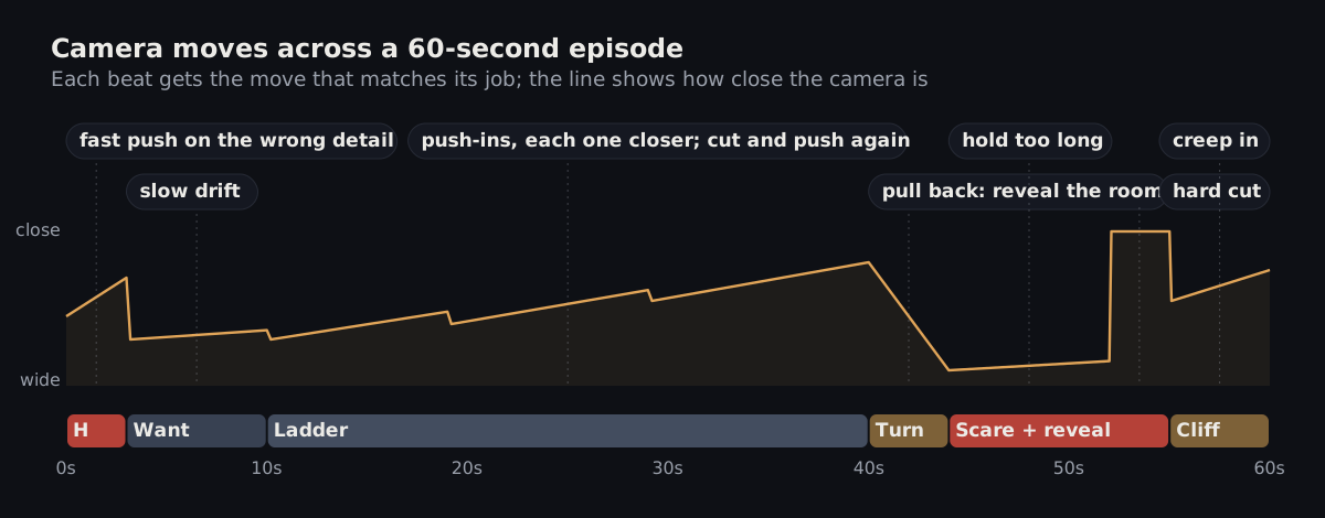
- Push-in: the camera slowly moves closer. It says "pay attention, this matters" and builds dread. Each push in the ladder should end a little closer than the last.
- Drift: a slow sideways or vertical slide. It keeps a held shot alive while the viewer scans the image for what is wrong.
- Pull-back reveal: the camera moves away and shows what was just outside the frame. It is the classic move for the turn.
- Hold: no movement at all, a beat longer than is comfortable. Stillness before the scare is what makes the scare work.
- Hard cut: the scare itself. A cut is faster than any move, so save the fastest edit for the moment that needs it.
- Shake: small, fast noise on position and rotation. Use it for impact frames only; constant shake tires the eye and hides the art.
The beat names come from the structure in our 60-second horror script guide. Plan the moves on that beat sheet, not shot by shot in isolation: the rhythm of the moves is part of the story.
Four lighting setups that read on a small screen
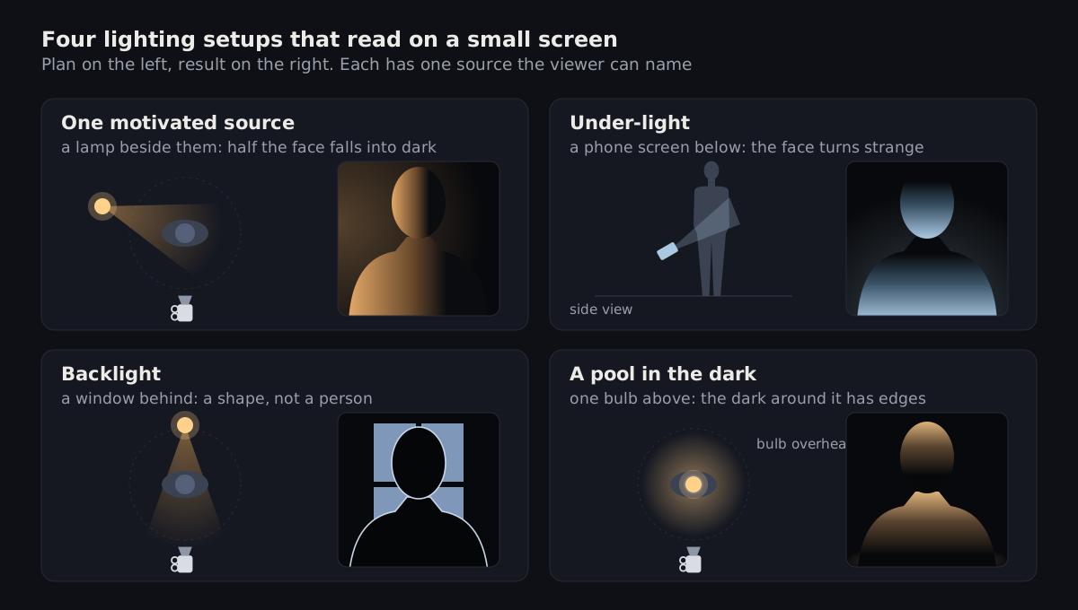
- One motivated source. A lamp, a candle or a window beside the subject. Half the face falls into dark, so the viewer never sees all of it. This is the default for most horror shots.
- Under-light. The light comes from below, from a phone screen, a torch held low or a fire. Faces lit from below look wrong because daylight never does that. Use it sparingly or it becomes a joke.
- Backlight. The source is behind the subject. The person becomes a shape with a bright outline, and the viewer fills in the face with something worse.
- A pool in the dark. One source above, a circle of light on the floor, and real darkness around it. The edge of the pool is the line the viewer is afraid to cross.
Darkness should have shape. A frame that is just dark grey all over is not scary, it is underexposed. Scary darkness sits next to light: the brighter the pool, the deeper the dark around it looks.
Light flat 2D art in code
With 2D art the light is not in the picture yet, so you add it as layers on top: a darkness layer with a soft hole where the light falls, and a glow layer that adds colour inside it. Both are plain CSS gradients in Remotion. The flicker uses Remotion’s random(), which returns the same value for the same seed, so every render of a frame looks identical.
import { AbsoluteFill, random, useCurrentFrame } from 'remotion';

type Props = { x: number; y: number; radius: number; color: string; darkness?: number; flicker?: string };

export const LightPool: React.FC<Props> = ({ x, y, radius, color, darkness = 0.9, flicker }) => {
  const frame = useCurrentFrame();
  // About one frame pair in twelve dips; same seed + same frame = same result on every render.
  const dip = flicker && random(`${flicker}-${Math.floor(frame / 2)}`) < 0.08 ? 0.55 : 1;
  const r = radius * (0.92 + 0.08 * dip);
  return (
    <>
      <AbsoluteFill
        style={{
          background: `radial-gradient(circle at ${x}px ${y}px, rgba(5,6,9,0) 0px, rgba(5,6,9,0) ${r * 0.35}px, rgba(5,6,9,${darkness}) ${r}px)`,
        }}
      />
      <AbsoluteFill
        style={{
          background: `radial-gradient(circle at ${x}px ${y}px, ${color} 0px, transparent ${r * 0.8}px)`,
          mixBlendMode: 'screen',
          opacity: 0.35 * dip,
        }}
      />
    </>
  );
};
src/LightPool.tsx: darkness with a lit hole, a warm glow and an optional flicker. x, y and radius are in pixels of the 1080x1920 frame.
Place the pool where the source would really throw light: below a lamp, in front of a window, around a screen. For under-light, put the centre below the face and keep the radius small. For a backlight, put a bright shape behind the subject layer and darken the subject itself; the outline comes from the contrast.
Code the camera: push-in, drift and a Dutch tilt
A camera move on 2D art is a transform on the layers: scale for a push-in or pull-back, translate for a drift, rotate for a tilt. Give each layer a depth factor and move the near layers more than the far ones, and the flat picture gets parallax.
import { AbsoluteFill, Easing, interpolate, useCurrentFrame } from 'remotion';

export type Move = { zoom: [number, number]; pan?: [number, number]; roll?: [number, number] };

export const Camera: React.FC<{ move: Move; frames: number; depth?: number; children: React.ReactNode }> = ({
  move, frames, depth = 1, children,
}) => {
  const frame = useCurrentFrame();
  const t = interpolate(frame, [0, frames - 1], [0, 1], {
    easing: Easing.bezier(0.33, 0, 0.2, 1),
    extrapolateLeft: 'clamp',
    extrapolateRight: 'clamp',
  });
  const lerp = ([a, b]: [number, number]) => a + (b - a) * t;
  // depth scales only the change in zoom, so every layer starts at the same zoom and keeps its corners covered
  const zoom = move.zoom[0] + (lerp(move.zoom) - move.zoom[0]) * depth;
  const pan = move.pan ? lerp(move.pan) * depth : 0;
  const roll = move.roll ? lerp(move.roll) : 0;
  return (
    <AbsoluteFill style={{ transform: `translateX(${pan}px) rotate(${roll}deg) scale(${zoom})`, transformOrigin: '50% 45%' }}>
      {children}
    </AbsoluteFill>
  );
};

// A slow push-in with a 6 degree Dutch tilt, on three layers:
// <Camera move={{ zoom: [1.18, 1.3], roll: [0, -6] }} frames={90} depth={0.6}><Background /></Camera>
// <Camera move={{ zoom: [1.18, 1.3], roll: [0, -6] }} frames={90}><Subject /></Camera>
// <Camera move={{ zoom: [1.18, 1.3], roll: [0, -6] }} frames={90} depth={1.4}><Foreground /></Camera>
src/Camera.tsx: one eased move per shot. depth 1 = the subject layer; less for the background, more for the foreground.
Two details keep it clean. Pass the shot length as frames so the move fills exactly its shot. And when you roll the frame, scale up enough to hide the corners: rotating a 9:16 frame by an angle a needs a zoom of at least cos a + (16/9) × sin a, about 1.18 for 6 degrees. That is why the example starts at 1.18.
Plan it in a shot list
Write every shot’s angle, move and light down before anything is built, with one more column: why. A choice you cannot justify in five words is decoration, and decoration makes episodes longer and weaker. The example continues the made-up hotel story from our AI horror Shorts workflow.
shot  sec        angle        move               light                       why
s01   0.0-2.4    eye level    fast push-in       bedside lamp, face half lit  hook: he hears his own voice
s02   2.4-5.8    high angle   hold               lamp flickers once           he is small next to the wall
s03   5.8-11.0   eye level    slow drift right   lamp + crack of hall light   the room, and the door he needs
s04   11.0-19.0  low, behind  push-in            hall light under the door    something is on the other side
s05   19.0-21.0  overhead     hold               pool around the bed only     trapped: the dark takes the room
s06   21.0-23.0  ground       hard cut           backlit doorway              the scare: the door is open
shots.md: one line per shot. Claude Code can stage straight from this table.
Read the columns top to bottom before you build. The angle should not stay the same for three shots in a row, the light should get smaller as the episode goes on, and the hard cut should appear only where the story needs the scare.
Our animated horror reels skill packs these rules into a camera, light and grade system with a palette builder, and an episode spec where every shot is written down before it is built.
Check the stills before you render
Render one still per shot and review them side by side, at phone size:
- Squint test: blur your eyes. If the subject does not separate from the background, raise the light on them or darken what is behind them.
- One source: every lit area can be traced back to a lamp, a window or a screen in the scene.
- Power matches angle: the threat is never shot from above unless the story says it is losing.
- Variety: no three shots in a row share an angle, and the scare shot looks like none of the shots before it.
- Band: the face, the key action and the caption sit between 25% and 65% of the height.
Next: pick the colours that go with these setups in horror color palettes and grading, or see the whole episode workflow in how to make AI horror Shorts with Claude Code.